The first impression makes all the difference when you are trying to generate more lead, finding new customers, dealing more sales, inspiring people to take your service, generating fund for cause, trying to grab more market share or just to showcase your expertise. All these work can be effortless when you have an evergreen website.
I like to compare a website with people’s living room. When you visit someone’s home first thing you see is their living room and right away you make a judgment. Don’t worry I am not judging you. It is absolutely okay because we human tend to consider first impression very important and we cherish that through our engagement with that person or business in the future. Put yourself in customer’s shoes and ask will you trust a business with a crappy and unprofessional website in this modern age. If it looks dated, visitors might think you’re behind in more ways than one. If it’s too trendy, you run the risk of not being taken seriously.
So, what’s just right? An evergreen design that is clean and focused on usability. These guidelines will help you get your site in that sweet spot.
1. Standard Design Features
I am not saying your website have to be like others, which certainly won’t help it stand out. This is not the criteria of an evergreen website in the first place. Instead, you should embrace a typical approach to design to make it easier to navigate.
For starters, your business’s logo should be at the top so that guests know they’ve come to the right place. Make it clickable so that it doubles as an easy way to get to the homepage.
Next, make sure you have a contact button, which is often in the top right corner of the page so that potential clients know how they can reach you. If they have to go searching for a phone number or email address, they might just move on to the next option.
Be sure to keep navigation at the top of the page horizontally, making it a cinch to browse your site. A key function to include here is a search feature; whether it’s a box or icon, this will make it easier and faster for those perusing. For sites that are packed with content, this is typically the most used design element. It’s also a great cheat for websites that aren’t organized that well — though that’s something you should fix ASAP! However, if your site doesn’t have a large amount of content, this isn’t always necessary. To curate a customer list and stay in touch with your base, have a signup box in the footer where people can subscribe to email updates.
2. A Strong Home Page
You only have a few seconds to grab people’s attention, so make sure your home page is working hard. The landing site should have it all: a visually appealing design with strong images that deliver your message clearly; well written and SEO optimized to get your mission across; and a clean, obvious path for navigation.
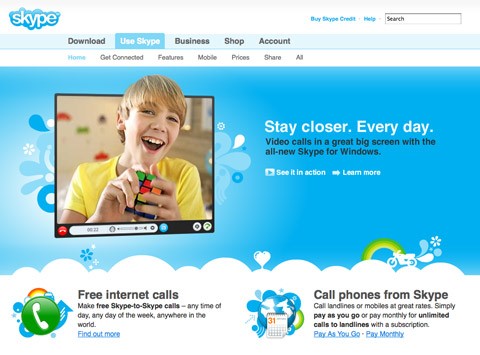
Make your homepage as tailored as possible so visitors feel that they’re getting to know you.
Additionally, have a call-to-action button up front to encourage engagement. For example, “buy now” can lead to your e-commerce page or “learn more” could bring users to a page where they can sign up for your newsletter and make your evergreen website successful.
3. Include Social Media Icons
The footer of your site is typically the best place to include the signature icons that link to Facebook, Twitter, Instagram, Pinterest, and other social media platforms.
Practically a standard design element these days, social icons are crucial for showing customers another side of your business. Keep in mind that your Facebook page or Twitter handle can say just as much about your business as your website can.

And social channels are also key for spreading the word and reaching new customers. Most of the customers say social media is one of their preferred methods of communicating with businesses. This way people will learn about your evergreen website even faster.
4. Use Responsive Design
It’s important to remember that not everyone will be visiting your site on a computer, so be sure that it works equally well on phones, tablets, and other devices. In fact, last year Google confirmed that more searches on their site took place on mobile devices than computers in the U.S. and nine other countries. In general, mobile now takes up 65 percent of all digital media time.
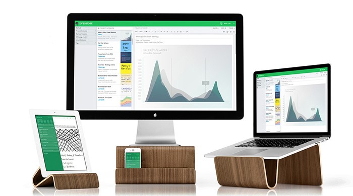
Adapting to being mobile friendly after a site has already been built is tricky, but worth the time and effort. From my experience companies often neglect these factors when building their evergreen website but it can hurt your business most. For new sites or ones that are about to launch, keep mobile devices in mind when designing and programming.
5. Build a Brand
A website is a key component of any brand, so be sure your website’s design gets your message across, whatever that may be. Another angle to keep in mind is staying consistent, so that can mean making sure the fonts and colors are the same as on your business cards.
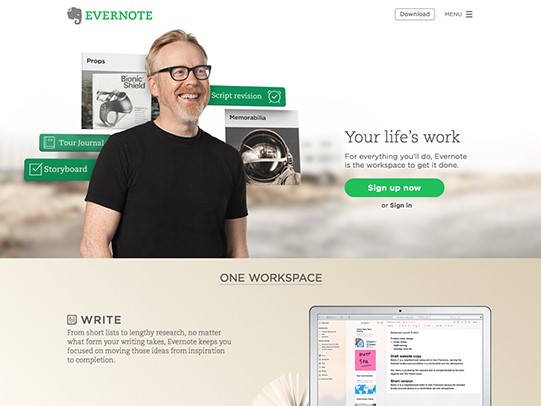
Color palettes, fonts, and the tone of voice are different for every business and site, so think those through. Also, create a style guide so that your text is consistent and has a point of view. Images are a natural way to add visual interest and get the aesthetic across.
Tip: Design choices may seem trivial, but you need to take them seriously. They can have a big impact on your future growth. This tips will surely help you building your evergreen website that people love.
These guidelines are the basics to getting started on building a great site. But if you’re still unsure of your website design or development, head over to ORBIT INFORMATICS or mail us at – info@orbitinformatics.com.
After all, you have a business to grow.
Like what you’ve read? Subscribe to our blog by adding your email address to the form on the right. You’ll be the first to hear about our updates! Feel free to share on Twitter or Facebook by using the super-easy share buttons on the bottom right!

